Industrial Design
|
|
Title: The Echo Mask
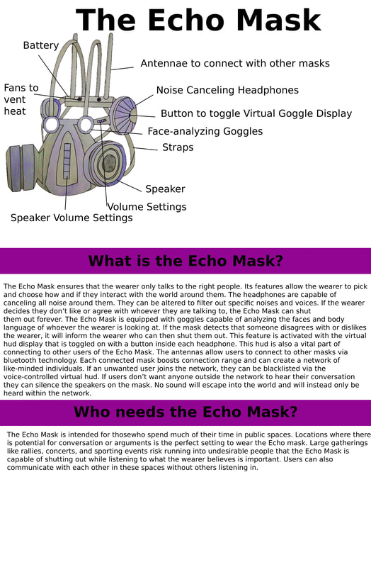
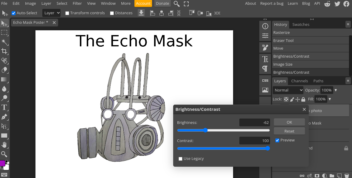
Size: 19 in x 29 in Medium: Photopea Date of completion: 12/16/2023 The Echo mask ensures its users talk to only the right people. Its headphones are capable of canceling specific noises and voices. The goggles are capable of analyzing faces and body language to inform users of how they feel about them. It can connect to other masks via the antennas and the speakers can prevent the user’s voice from escaping. This product is inspired by the work of the concept artist Wesley Burt. Specifically, his helmet/gas mask concept art for the video game Fallout: New Vegas. The intention of this product is to mimic the idea of an echo chamber. Hence the name, Echo mask.
|
Inspiration-
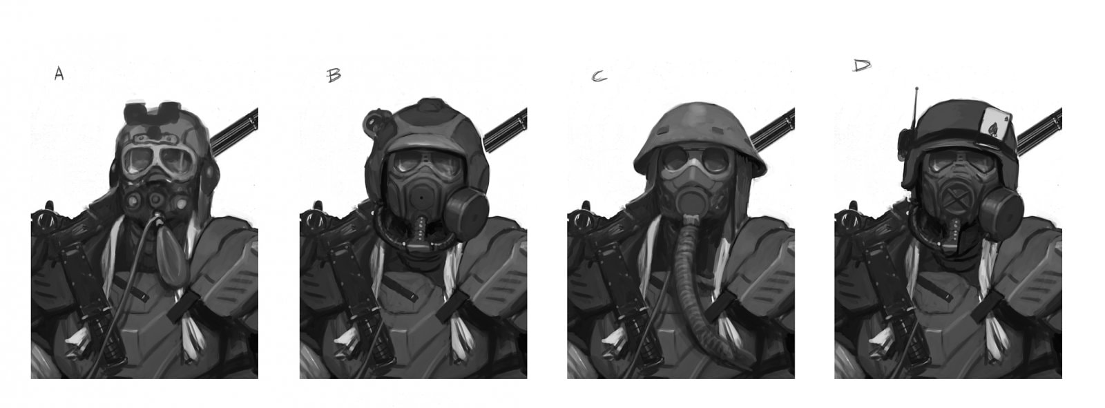
Wesley Burt
NCR Ranger Helmet Concept Art
(Main Inspiration) |

NCR Ranger Concept Art
|
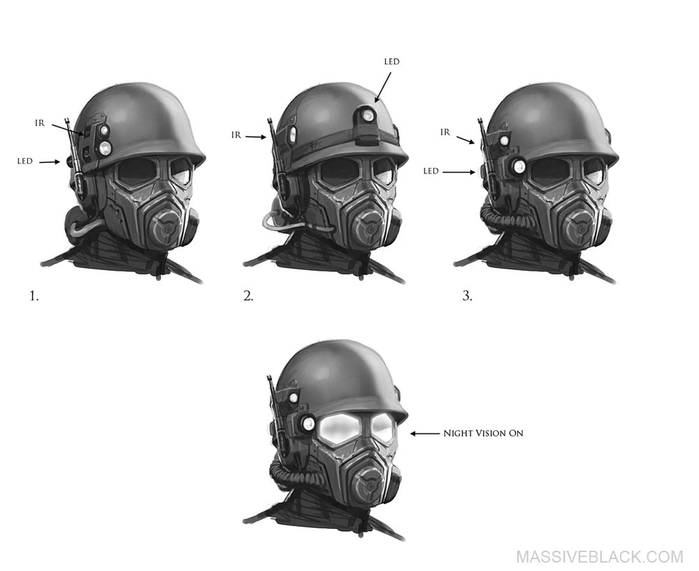
Wesley Burt is a concept artist/illustrator. His concept art for the video game Fallout: New Vegas is what inspired my own piece. Since his work is concept art, I thought it would be a good idea to use it as inspiration for my conceptual industrial design piece. Burt’s design was intended for a video game with a nuclear post apocalyptic setting. The helmet had to be reasonable attire that would protect wearers in a hostile desert environment. Emphasis is placed on protection from the elements. Its form covers the entire head of the wearer. The helmet has multiple features designed to serve the wearer in a variety of ways. The top of the helmet is a large round shape. This large shape is to offer its wearer the largest physical protection possible. The facial area is very angular. The mouth area extends outwards and is formed into a pentagon. A circle is also placed in this area. The eye area is large and has an angular shape. Its large shape is intended to give its wearer a large amount of visibility. The mask has several slightly different designs concerning the issue of light. In one version of the helmet, The lenses of the helmet are capable of activating night vision. However, the other versions of the helmet have what appear to be external additions to the helmet. These versions appear to have LED flashlights attached to the upper helmet in order to provide the wearer with a means of lighting. In two of these versions, the flashlights appear to be bolted in place onto the side of the helmet in order to be held in place. In the third version, the light is tied to the top portion of the helmet. Hardly any space is left unused on the helmet. All of it is dedicated to the multiple features it offers.
Planning
Rough Sketch (V1)

Echo Mask V2
|
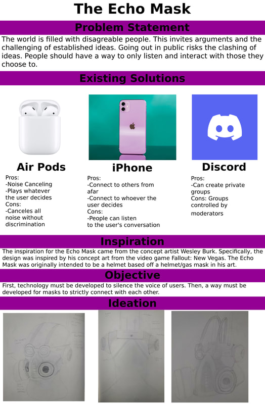
The idea behind the Echo Mask is to be a physical version of an echo chamber. An echo chamber is when someone surrounds themselves with people that only affirms their already established ideas. In an echo chamber, ideas cannot be challenged. This idea was used to tie in with my political theme. When it comes to political media, people will often only listen to those they already know have the same perspective as them. People don’t consume media that is on the opposite side of the political spectrum because it is easier not to challenge their own political ideas. So the Echo Mask is a parody of the lengths people will go to in order to stay inside an echo chamber. This is the very first sketch I made while coming up with the Echo Mask. It is heavily based on Wesley Burt’s design as it still retains the form of a helmet that encompasses the entire head. This sketch was made with the intention of presenting the idea of the Echo Mask to an industrial designer by the name of Murf. Murf critiqued the practicality of the helmet design. It would’ve been cumbersome to wear and travel with. After this meeting, I abandoned the helmet design. From the helmet design came the gas mask design. The reason for the gas mask look was to relate back to its purpose. Gas masks protect the user from hazardous chemicals while the Echo Mask protects the users from opposing viewpoints. Instead of a cumbersome helmet, wearers would have adjustable straps they could use to wear the mask. Version 2 of the Echo Mask also came with the back battery. I realized that I needed a way to power the features of the mask. Which is why I came up with the idea to add a battery with a charging port to the back of the mask. However this battery did introduce a problem that was addressed later. 
|
Class Critique

|
Everyone in my class was subjected to a class critique of everyone’s ideas. The class, including my teacher and Murf, would critique aspects of each idea so the creator could fix any issues with their design. Before the critique, we had to make very quick sketches of our ideas on a whiteboard with dry erase markers.
One of the critiques that stuck with me was about my inclusion of the battery. People pointed out that the battery would produce heat. This was a problem because the battery was placed on the back of the head meaning it would burn the user. I had to find a way to cool the battery. Which I did. In my version 3 design, the battery included small fans that would vent the heat of the batteries. This allowed the battery to be on the back of the head without burning the user. 
|
process


|
Before I could create the first poster, I had to create the final design for the Echo Mask. So on one large sheet of paper I drew another sketch for the Echo Mask. This way I could fix issues that were present on the second version of the Echo Mask.
Once I finished the sketch, I could make the final design for the Echo Mask. This being the third version of the Echo Mask. When I finished drawing, I used a thin sharpie to go over all of my lines to help the image pop more. After I finished going over the lines with a sharpie, I began to color it. To color, I used crayola color pencils because I had them on hand and they were of decent quality. I only used purple and black. However, there was a problem with how I colored the image. I colored the image lightly. In my eyes, it looked fine and the colors and different shades were visible. However, in the pictures I took it was very hard to even see the colors. This is a problem that I would address in Photopea. 
|

|
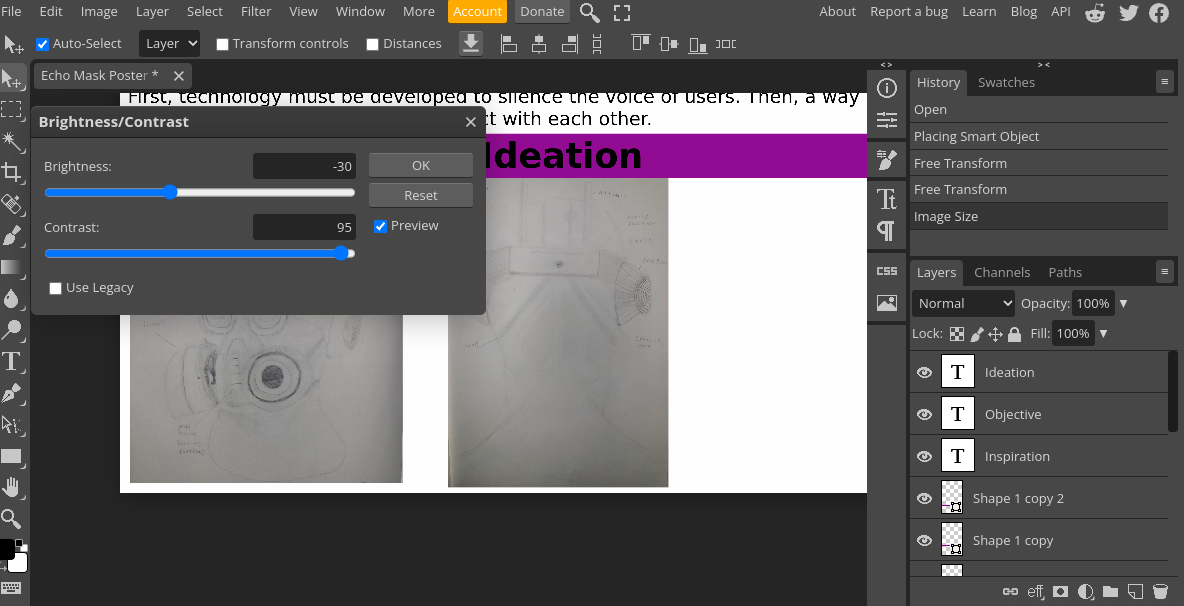
I fixed the issue of the hard to see colors in photopea. In photopea, there are several ways to edit the colors of images. The options I chose to edit were “vibrance” and “contrast”. These settings allowed me to increase and decrease the contrast, brightness, vibrance, and saturation. I first edited the contrast. I decreased the by a bit while I increased the contrast dramatically. After that, I turned my attention to the vibrance and saturation. I increased both of these by a lot. This helped me achieve the look I wanted. The colors of the image now popped out more.
The changing of contrast was something I used for other images that had a low visibility. Notably the ideation images. Overall, making the posters was simple. Most of it was adding text boxes and changing the font sizes. It took me a while to settle on the font sizes because the posters only had so much space. I did have difficulty when it came to adding images. A chromebook was used while making the posters and it is not very compatible with Photopea. It would constantly crash for even the simplest of things. However, adding images always caused my chromebook to lag and was the reason for most crashes. It even affected the final outcome of one of my posters. I wanted to add two more images on the poster describing the Echo Mask, but I just couldn’t. Hours were spent trying to load images in, but to no avail. Everytime I tried it would cause my chromebook to crash. So in the end I just had to settle without them. |
Experimentation-
|
The contrast/brightness settings were things that I hadn't used before this project. The same goes for the vibrance and saturation settings. However, they were extremely similar to settings that I used in the experimental collage project that I did before this. So when I saw them I immediately knew what to do. All that was required was sliding the bars to either increase or decrease the selected setting. It was very easy just like the similar setting I had experimented with before this project. These settings were very useful for helping my images appear more visible. Without these settings it would have been very hard to see them.
|
|
Adding shapes into the poster was not something I had done before. It's very easy to overlook among the other more complex settings. However, it was quite important for adding visually appealing elements to my poster. I didn’t want my posters to be completely void of color and visual intrigue which is why I decided to add purple rectangles. Purple was chosen because of the color of the Echo chamber. It turned out that adding a rectangle was very easy. I just had to stretch out the length and height of the rectangle for it to appear.
Changing the color of the rectangle was also quite easy. I only had to drag a cursor over a square of purple and select from whatever tone, shade, or hue that I wanted. 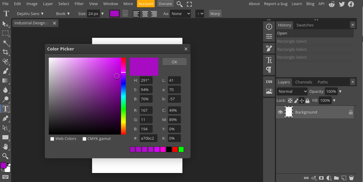
|

|
I’ve never thought of color pencils as something that could actually be used in proper art. I only ever used them for childhood drawings or whenever school required me to color something. It never occurred to me that they were capable of actually creating something that looks good. I’ve always treated them as amateur tools when I could’ve been treating them as real ones. This project taught me that color pencils are valid art tools.
|
Critique-
|
|

|
Compare-
Both Burt and I employ the same use of form. The entire piece is meant to encompass someone’s entire head. This being the reason for the large proportions present in our designs. If someone must wear it, then it must be big enough for someone to fit inside.
Both of our designs are purely conceptual. Burt’s design does not exist in the real world as it was designed for a fictional setting. My mask is supposed to be a parody of the concept of an echo chamber.
Both of our designs are purely conceptual. Burt’s design does not exist in the real world as it was designed for a fictional setting. My mask is supposed to be a parody of the concept of an echo chamber.
Contrast-
Burt’s helmet hold practically zero negative space. No space is wasted in his piece. However mine is the opposite. Much of my piece is negative space as it is supposed to wrap around the head with adjustable straps. However, Burt’s helmet leaves nothing exposed as its purpose is to protect the wearer from physical harm while mine protects the wear from ideas.
Burt’s helmet does not employ balance like my mask. The Echo Mask is meant to be symmetrically balanced. Each feature is present on both sides of the mask. This is not the case with Burt’s helmet. It is not symmetrically balanced as some features are not present on both sides of the helmet. For example, a tube and an antennae are present on one side of the helmet, but not on the other.
Many of the shapes on Burt’s helmet are angular with only some organic ones. These angular shapes are more present around the facial area. However, my mask is almost completely made up of organic shapes. With some of the few exceptions being the volume buttons and the battery.
Reflection-
Before this project, I never really considered industrial design as a career. In fact I never even heard of it before I met the industrial designer, Murf. To my surprise, I actually found myself enjoying the planning process more than anything. It was fun to let my mind wander and come up with interesting ideas. Then having those ideas come into being through drawing was satisfying. I never thought I’d enjoy product design as much as I did. I could see myself going into industrial design in the future, but I’m still confident that I will for sure. Actually making the poster was a miserable experience. Though that’s mainly because of the device I was using. It took me hours to even get the slightest bit done because I kept losing progress due to frequent crashing. However, this experience has taught me that if I’m going to be serious about art, then I need to get the proper equipment. Using a chromebook to do this project is comparable to using old and dried out acrylic paint to make a baroque piece. There are better and more suitable alternatives that will get the job done. In conclusion, I hope that people view the Echo Mask as an idea born out of passion and intrigue for industrial design.
ACT Questions-
Clearly explain how you are able to identify the cause effect relationship between your inspiration and its effect on your artwork?
Burt's concept art is what directly inspired the original helmet design for the Echo Mask. The design evolved from there.
What is the overall approach the author has regarding the topic of your inspiration?
Burt's designs were a conceptual design for a fictional setting. While the design had to be realistic for the setting, he still included unrealistic elements in his work.
What kind of generalizations and conclusions have you discovered about people, ideas, culture, etc. while you researched your inspiration?
I have discovered that designs can get very creative when working from a conceptual perspective. It allows people to freely express their ideas.
What is the central idea or theme around your inspirational research?.
Creating a product that appeals to the human desire to affirm their own established ideas.
What kind of inferences did you make while reading your research?
I came to the conclusion that Burt was working purely from a conceptual perspective when designing the helmet.
Citations-
“Wesley Burt Wesley Burt - Concept Artist, Designer, & Guest Artist.” Visual Arts Passage, visualartspassage.com/mentors/wesley-burt/. Accessed 17 Dec. 2023.
Images-
“Title: Discord" Icon - Download for Free – Iconduck.” Www.google.com, images.app.goo.gl/NKAbAcgsFA8WwxDY8. Accessed 17 Dec. 2023.
“Title: Apple IPhone 11 Review, 3 Months Later: Why It’s My Favorite IPhone.” Www.google.com, images.app.goo.gl/Y52iVAFgETHFcEhm6. Accessed 17 Dec. 2023.
“Title: Buy AirPods (2nd Generation) with Charging Case - Apple.” Www.google.com, images.app.goo.gl/o3UHkL4zttNKrcaJ6. Accessed 17 Dec. 2023.
“Wesley Burt.” Fallout Wiki, fallout.fandom.com/wiki/Wesley_Burt. Accessed 17 Dec. 2023.
