
Planning
(Journal Planning)

|
Crystal PaintingColorful Clash
23cm x 18cm Acrylic Paint 9/21/23 Exhibition This piece was created to refine my skill and technique with paints. This piece is based on a zoomed in portion of a picture, found in a handout, of a bubble containing a variety of colors, shades, tones, and shapes. There were no artists used as inspiration for this piece. The zoomed in portion of the image was turned into a grid. The grid was then transferred onto a canvas. The image was then sketched on top of the grid. Acrylic paints were applied onto the canvas using flat head paintbrushes. This is the photo my painting is based on. The photo appears to portray a sort of bubble containing a variety of colors. All of them clashing with each other. This clashing of colors is what really drew me to this piece which is why I chose to paint it. I chose to specifically focus on a portion of the piece where light and dark blues and reds clash with each other. 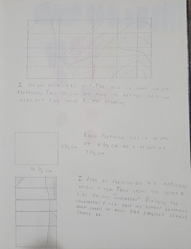

|
This is the grid drawn onto the picture and the sketch on the canvas. Both were 5 x 5 grids. The grid size was chosen in order to capture important and large areas. I didn't want to make the grid too small because it would have made sketching the image more difficult for me. The 5 x 5 grid also worked well for transferring the 5cm x 2.5cm image I was referencing to the canvas. Each rectangle on the reference grid was a 1cm x .5cm rectangle while the ones on the canvas were 4.5cm x 3.5 cm rectangles.
Process
Stage 1

|

|
I took a while to decide on the grid I wanted to use. Originally, I though many squares/rectangles would be better for painting. However, this changed when I actually drew a 6 x 12 grid onto my canvas. I realized that I would have a harder time making out the image when painting because my eyes would be distracted by the grid. This also made it difficult for me to see the image below the reference grid So I scrapped this idea in favor of the 5 x 5 grid. The 5 x 5 grid translated better to the canvas. It also helped me better identify the shapes as well as the tones and shades of the colors from the image.
Stage 2

|

|

|
It was difficult to sketch the image onto the canvas. The problem was that the image I was referencing was very small compared to the canvas. Figuring out the proper proportion was one of the most difficult steps when creating this piece. At first, I simply drew everything in the image from left to right. Along the way, I came up with a remedy for the problem. This remedy was through drawing what I refer to as “landmarks”. I started to draw the bigger and more easily viewable shapes first. These shapes/landmarks helped me better identify the the smaller details.
The second issue had was light. While sketching out the image, I noticed that I was seeing shapes that didn’t exist. As well as changes in the shades and tones of colors that weren’t there. More specifically, they didn’t exist from certain perspectives. Depending on the angle I was looking at the image, the light in the room was able to tricked my eyes. It started forcing my eyes to see changes that weren’t really there. I adapted to this revelation by viewing the image in different light. If the shapes still appeared in the different light, then I kept it. If it didn’t, then I took it out.
The second issue had was light. While sketching out the image, I noticed that I was seeing shapes that didn’t exist. As well as changes in the shades and tones of colors that weren’t there. More specifically, they didn’t exist from certain perspectives. Depending on the angle I was looking at the image, the light in the room was able to tricked my eyes. It started forcing my eyes to see changes that weren’t really there. I adapted to this revelation by viewing the image in different light. If the shapes still appeared in the different light, then I kept it. If it didn’t, then I took it out.
Stage 3


Experimentation


|
Painting in solid colors was difficult for me. The main reason was because of my brushstrokes. Early on, I adopted quick and short brushstrokes. This resulted in failing to achieve the smooth solid look in several places. Sometimes I even ended up brushing paint off of my piece. This would result in me having to apply many layers of paint to my piece. These layers appeared very thick compared to other areas. Thereby ruining the look. Having to apply all of these layers was very time consuming. In order to reduce the severity of the issue, I started to apply quick base coats with light tones. Once the base coats dried, I moved on to the final coats. By this time, I started to adopt longer and steady brush strokes. This helped me achieve the smooth look I was going for.

These are the shades and tones of blue that I used in this piece. Originally, I used acrylic cerulean blue to paint. However, later on I switched to using acrylic primary blue. This blue was mixed with black and white acrylic paint. Specifically, mars black and titanium white. It was more difficult to mix darker shades than it was the tints. Often I’d end up making very dark shades of blue that too dark for the area I was painting. So I would have to occasionally mix blue, white, and black together in order to create the shade I wanted.
This is my color palette for all my reds, oranges, and yellows. I specifically used primary red, yellow, and cadmium orange hue. When it came time to use these colors, I realized that I wouldn’t be able to achieve certain tones by just mixing with black and white. I had to mix these colors together. Sometimes all three together, and sometimes just two of them. However, I had to be careful when I did this. They had to be mixed very well or else different tones would still be left in the paint. So if I wasn’t paying attention, I could accidentally paint with different tones than I thought I was. It would be subtle, but it still ruined the solid look. I originally mixed my paint with toothpicks. This was an effective way to mix my paint. Especially when it came to mixing precise amounts of paint with each other. For example, if I was trying to achieve a specific tint of blue, using a toothpick made it easier pick up smaller bits of white. I could keep adding these smaller bits of white until I finally achieved the tint I wanted. However, there was one drawback. Since toothpicks are so small, they were less effective for mixing larger amounts of paint. So I started to use them less when it came to mixing paint for the larger shapes. My other way of mixing was with my paintbrushes. They were a lot more effective for mixing larger amounts of paint. Not only that, but they were also quicker. I mainly used my larger flat head to mix, but I did use the smaller one occasionally. However, like the toothpicks, there were drawbacks when it came to mixing with my brushes. It was harder to control how much paint I picked up with the larger brush. So sometimes I ended up making a different tone than what I wanted. Mixing with my brushes also had the consequence of damaging some of the bristles and staining them. 
|
Reflection
This project provided me some much needed insight into my skills in painting. I've had experience painting before but it was mostly in blending. This project required me to paint in solid colors. It forced me to identify changes in shape and tone to better convey these colors. In order to do this, I had to change my technique. When I started, I used quick and short brushstrokes. However, these strokes didn’t achieve the solid look. I had to adopt long and steady strokes to do this. Evidence of my failures can still be seen in my piece. They were reminders for me to stop making the mistakes that led to them. From these failures, I learned how to successfully convey solid and smooth colors. From this I was able to develop as an artist. When people view this piece, I hope they see my failures so that they can compare them to where I succeeded. I want this to be a lesson that an artist must adapt to difficulty and failure, so that they may refine their skills. This piece will stand as the progress one must go through in order to better themselves as an artist.
