
|
Block PrintTitle: So-Called Silent Majority
Size: 22.5 cm x 15 cm Medium: Black ink on wood block Date of Completion: 10/11/ 23 This piece was my first time attempting block printing. Other than when working with clay, I’ve had little experience using tools to create art. Block printing helped me branch out to different mediums and expanded my skill set. This piece is influenced by German Expressionist art. More specifically, it is heavily influenced by the works of the German Expressionist, Kathe Kollwitz. My piece makes references to her style of shading and shape while also using a style that is unique to me.
|
Inspiration- Kathe Kollwitz
|
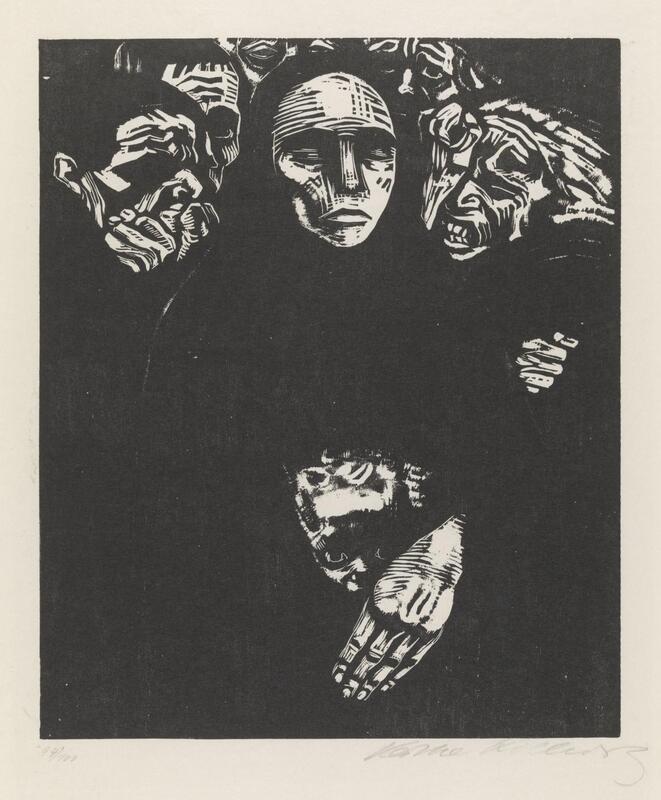
The People (1922)
|
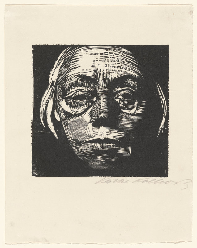
Frontal Self-Portrait (1923)
|
My piece is inspired by the block prints, The People and Frontal Self-Portrait, by Kathe Kollwitz. These pieces emulate the style of German Expressionism. Her art style will help me better understand how shape can be used to define form and space.
I admire The People for its ability to tell a story with so little detail. This piece manages to accomplish getting across the feeling of despair and anguish with faces alone. I was captured by how this piece guided my eyes into experiencing this story. At the top of the piece, people can be seen in the background looking to one central and emphasized figure who stands in contrast to them. The figure stands tall and looks beyond the piece. They have not fallen to the same despair as the others. And below the figure lies their hand protecting a child. This child also looks straight back at the viewer. It is this type of storytelling that I want to accomplish in my piece.
The People is part of a series of seven woodcuts created for Kollwitz’ 1921-1922 “War” series. The image was subtracted from a wood block and then covered with black ink. This piece (as well as the six other woodcuts) was created as a response to World War 1. The war had ended just a few years before in 1918. Kollwitz herself was living in Germany at the time of the war. Her own sons fought for Germany during the conflict. One of them, Peter Kollwitz, died early on in battle. It is Kollwitz’ feelings of loss and anguish that moved her to create the piece. The feeling of suffering can be felt through the anguished look of the people in the background of the piece.
The People uses shape to help define form and space. Despite there being people in the piece, it is mainly their faces that can be made out. It lacks color and uses only black and white. Kollwitz defines form through black and white shapes. Large white organic shapes make up the faces of the people in the piece. There are also very small black shapes within the white ones. These shapes are placed in a way that resembles facial features. The black adds depth to these faces by acting as very intense shading. Black acts as both the negative and positive space in this piece.
Kollwitz’ self-portrait is very similar to The People both in terms of technique and background. It was made in 1923, only several years after World War 1. She would have likely been experiencing the same emotions that influenced her to create The People as she would have just completed her War series by this time. Shape is used to define form and space just as it did in the People. However, Kollwitz uses a method similar to crosshatching a lot more in this piece. Though instead of cross hatching in black, she does it in white. This use of cross hatching helps define the piece along with the use of shape.
The feeling of despair is felt in her self-portrait just like The People. Her eyes appear almost like a void yet her stare can still be felt. They are devoid of any sense of joy. She has a blank stare that is pointed directly at the viewer. It is piercing and cold. When I stare into this piece, it’s almost as if I can feel Kollwitz’ emotion through it. Those empty eyes leave me feeling the same. Completely empty. I admire how something as simple as this stare can cause me to feel emotions like this. Invoking emotions through my art is something I hope to accomplish.
Planning
|
Original Sketch Idea-
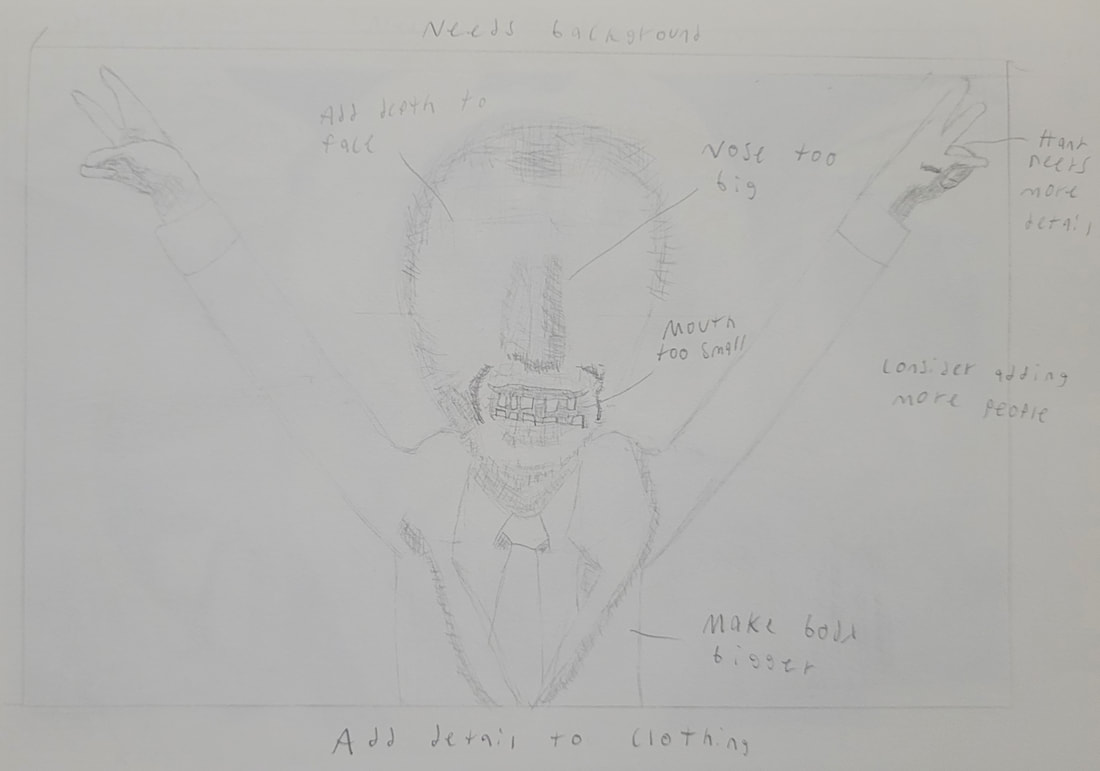
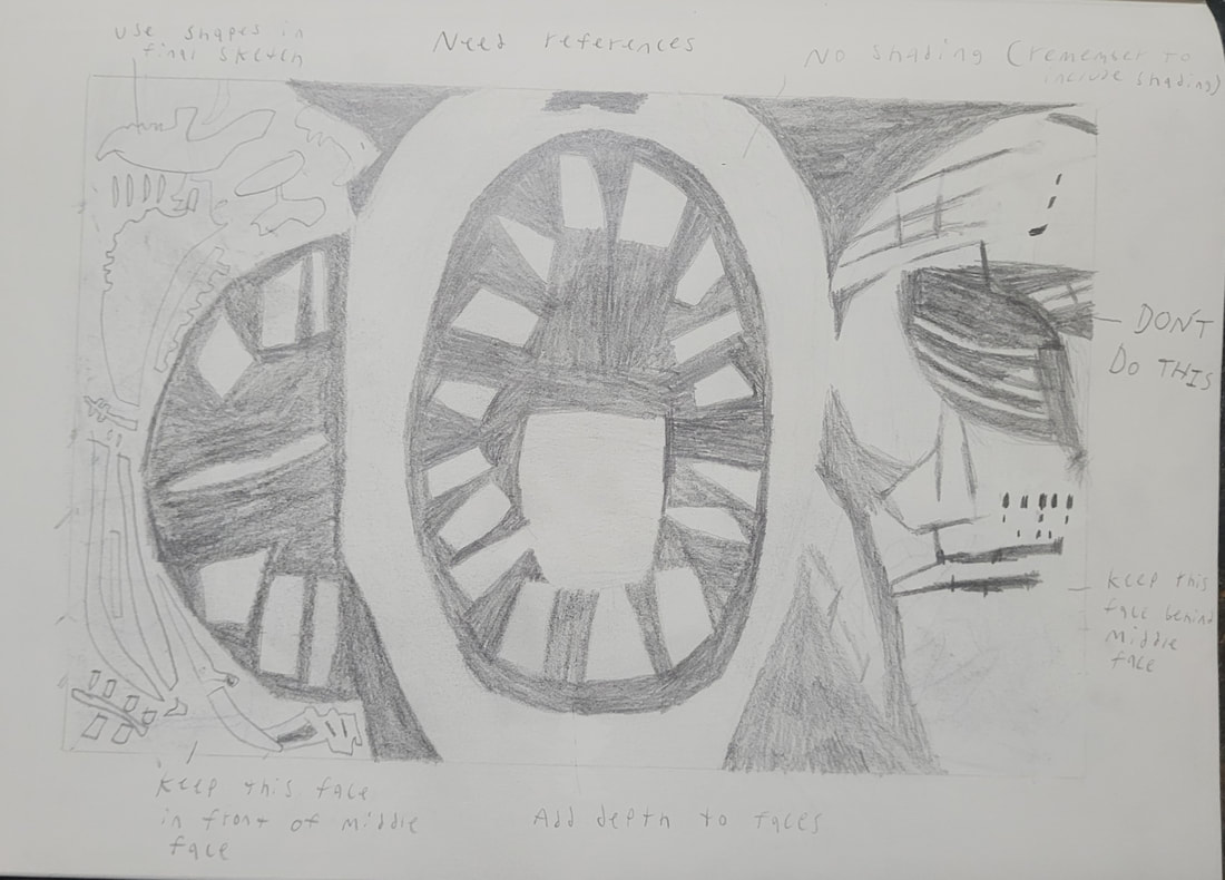
This is the original concept for my block print. It was drawn to scale with the wood block I was going to use. It is very rough because I don’t like to put a lot of time into sketches because I might not like how they turn out. Which is what ended up happening with this sketch. From the beginning, I wanted my piece to have a political meaning behind it. The figure in the middle is doing a pose often associated with U.S president RIchard Nixon. I wanted to criticize the “Silent Majority” narrative that he used. A narrative that is still spun in modern politics. However, I didn’t know how to complete my vision for this sketch as the background remained empty. I could have added a bunch of supporters in the background, but I didn’t want to just copy and paste a bunch of people. So I scrapped this idea in favor of what would become my final idea. Rough Sketch- This is the very rough sketch I made. This is the sketch that would eventually turn into my final one. I decided that I still wanted to have my piece criticizing the “Silent Majority”. However, I was having trouble sketching the faces. I originally wanted the faces to be very exaggerated, but they hardly ended up looking like faces. I also couldn’t figure out how to properly shade them. This was when I went to my teacher for assistance. He suggested I get reference photos of somebody making the faces that I wanted to sketch. I ended up taking his advice to improve my idea. |
Reference Photos
|

|

|
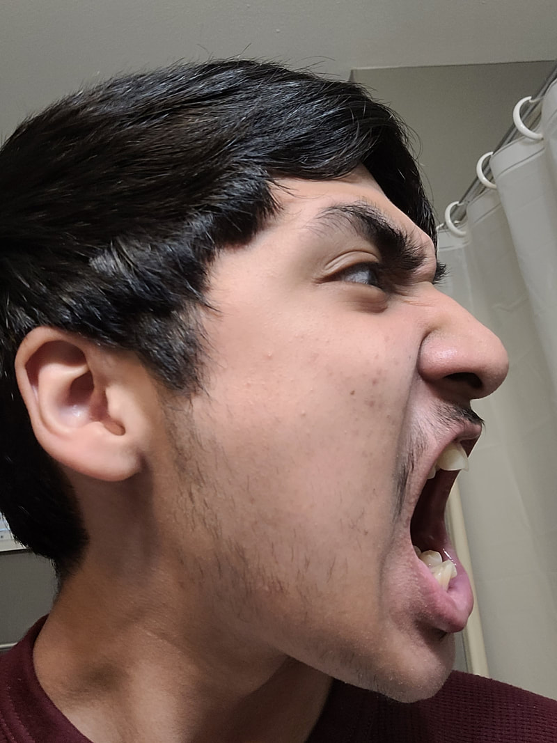
These are all photos of me. They are what was referenced in my piece. All of them were taken in the same lighting so that the shading would be the same on all of them. The good thing about using myself was that my teeth are crooked. This is a look that I wanted to have in my piece so all I had to do was draw my own teeth.

I sketched all three faces to look how they they did in my rough sketch. I still liked that design so I decided to keep it. Only now they actually looked like proper faces. Once I finished sketching with the proper proportions, I began my final sketch.

|
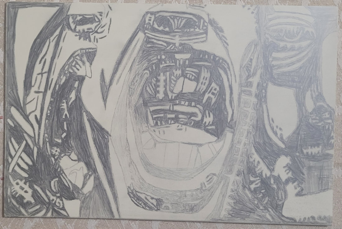
This is the final sketch that can be seen on my block print. I transferred the sketch I made before onto a different sheet of paper. That way I could keep the same proportions. Then I divided everything into shapes depending on their level shading. From there, is where I drew a bunch of shapes in the style of Kathe Kollwitz’ art. Once I made all of the shapes, I shaded in everything that would be black in the actual block print.
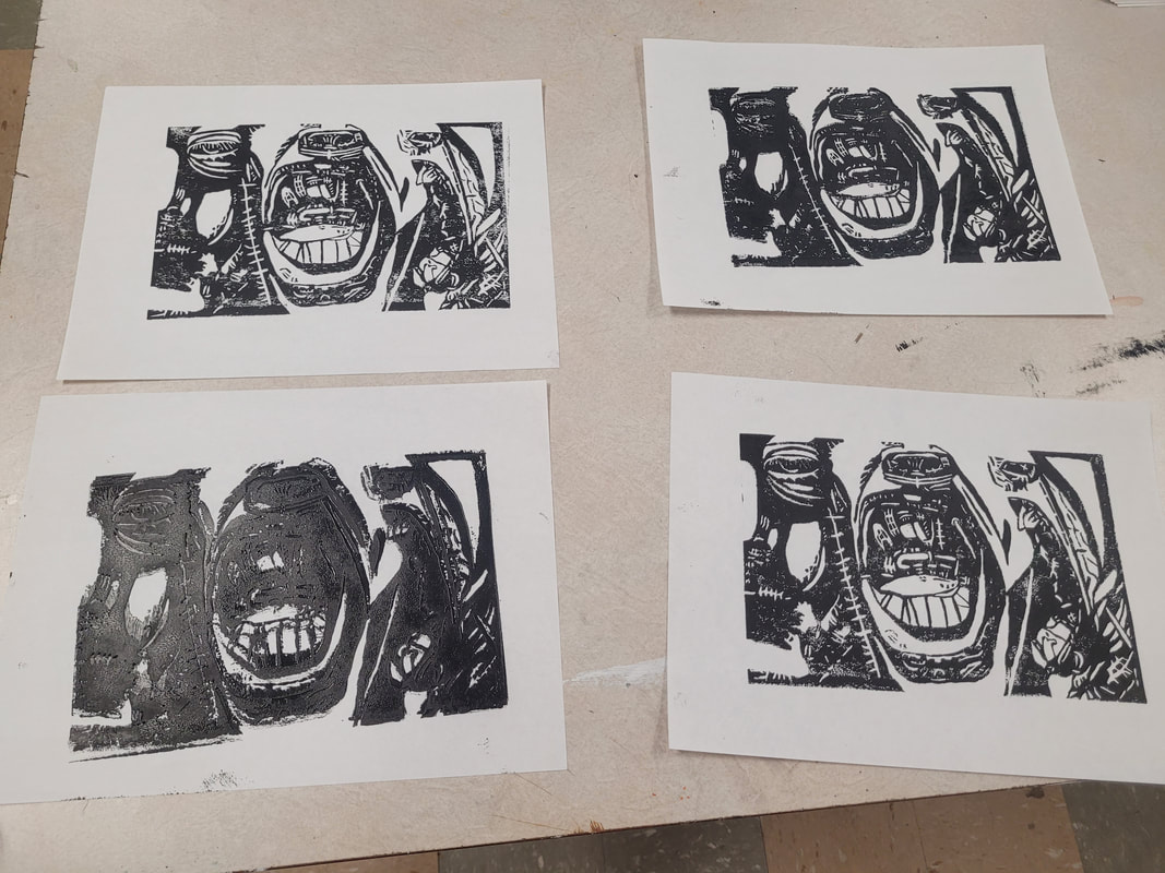
I followed through with the political theme. This design still emulates the “Silent Majority” narrative that I was trying to criticize in my original sketch. Two faces have their mouths opened wide with their teeth bared. This was done to show that they were shouting and aggressive. One face can be seen without a mouth. The decision to not include a mouth on that face was made to tell viewers that they are silent. Unheard among the many who scream their voices. This is how I achieved the criticism of the “Silent Majority”. A majority cannot be silent as they will always drown out the voices of the few. This is what I wanted people to take away from my piece. |
Process
Stage 1- Transferring

|
Before I could carve out the image, I had to transfer it onto my wood block. To do this, I cut my drawing of the design out of my sketchbook. Once I cut it out, I heavily coated the the back of it with my graphite using my pencil. Once this was done, I taped the graphite covered side of the paper onto my wood block. This was done so that it wouldn’t move.
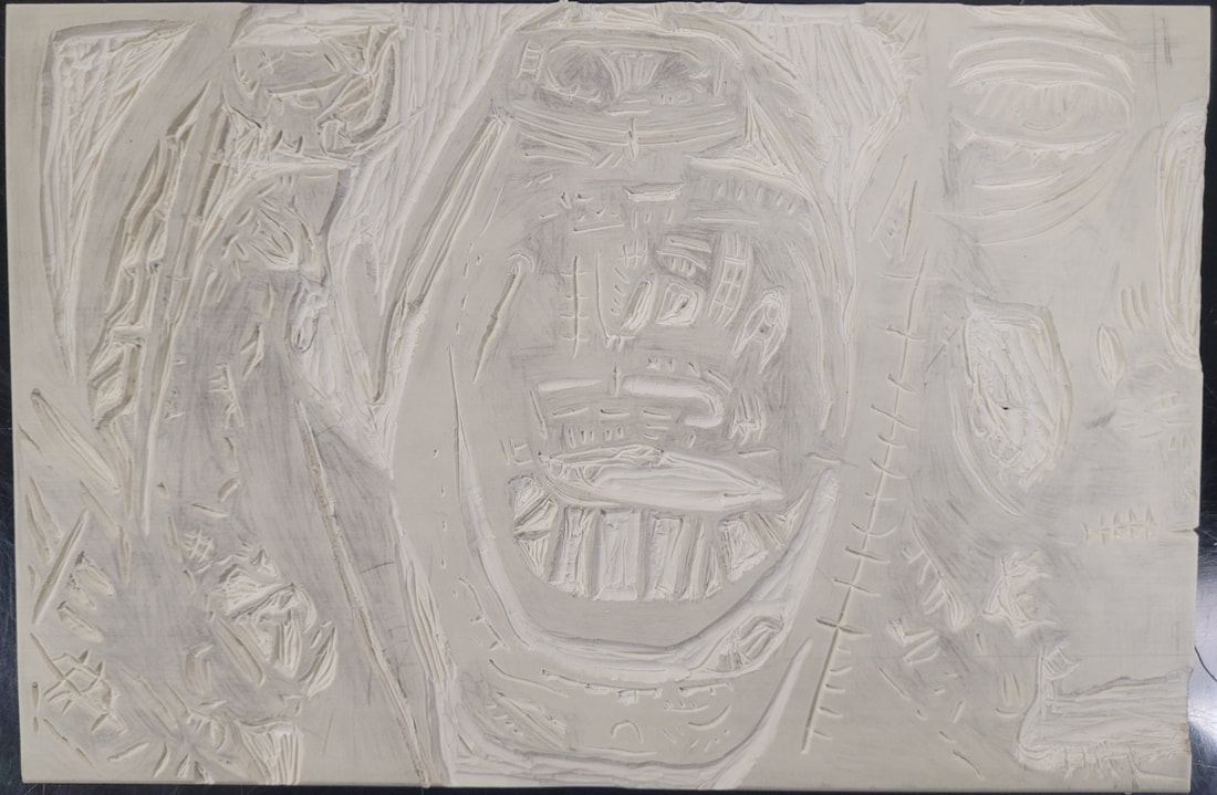
From there, I redrew every shape onto my wood block. This was a very simple process. However, I made a few mistakes when doing this. When transferring the image, I accidentally made some of the shapes thinner than I wanted them. I didn’t think it would be a problem at the time, but this issue would come up again later. Once I finished transferring the image, it was time to move on to shading in the image again. I shaded in the image again because I didn’t want to accidentally carve the wrong parts of the image. Shading in everything again would ensure that wouldn’t happen. However, I made a mistake during this process. I was getting impatient and didn’t want to meticulously shade everything in again. So I did a very lazy job of shading because I believed it wouldn’t be a problem. However, it became a problem when some of the shapes disappeared. The graphite ended up spreading to the white shapes. So they either became very hard to see or just disappeared completely. |
Stage 2- Carving

|
Carving was a bit confusing to figure out at first. The first challenge was figuring out how to even use the carving tool. I had trouble figuring out how to even attach the blades to the tool. When I figured out how, I then began using the tool upside down. However, it didn’t take long to figure out how to actually carve with the tool.
At first, I was carving very small pieces off. This was very slow and not very effective. As I progressed through the piece, I began to learn how to carve out longer strands. This was much more effective and saved me a lot of time. I carved out all of the longer and bigger areas first. This was because it was easiest and would allow me to learn how to control the tool before I got to the smaller details. The bigger areas were a lot less stressful to carve because there wasn’t much I could mess up. However, there was always the risk of using too much force. If I wasn’t careful then I would put a hole in my wood block or accidentally carve something I wasn’t supposed to. This is what ended up happening on some occasions. As I made these mistakes, I learned how to better control the carving tool. 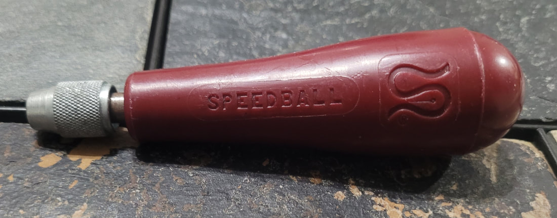
|
Stage 3- Printing
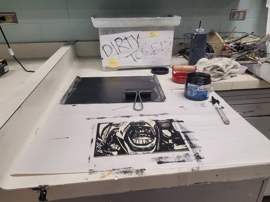
|
I believed that printing would be the easiest part in the entire process. At first I thought that it was as simple as rolling some paint onto the wood block and then transferring it onto some paper. However, this stage came with some unexpected difficulty.
To start, I grabbed all of my needed materials. The metal tray, the brayer, the baron, paper, the ink, my wood block, and palette knife. I put some ink onto the tray and rolled through it with the brayer. Once I had evenly coated the brayer with ink, I rolled it across my wood block until I believed it was evenly coated. I then placed a sheet of paper on top of the wood block and used the brayer to transfer the image. These were the steps I used. However, I didn’t always do them correctly. My first print appeared to not have enough ink on it. I thought I could easily resolve this issue by adding a lot of ink the next time. However, this only resulted in another problem. The ink covered areas that it wasn’t supposed to. This resulted in details being lost. To actually resolve this issue, I started to use the process of elimination. I paid attention to how the amount of ink would affect the print. From there, I created a range of how much ink I would actually need to correctly print. After a while, this ended up creating a successful print. |
Experimentation


|
I experimented heavily with the five blades I was provided. I had different uses for them depending on what shapes I was trying to carve out. Some of the blades proved more useful than others. A few ended up being completely useless to me.
The first blade I tried was the wide U shaped blade. This blade was useful for carving out large portions of the wood block. It became my go to blade if there was ever a large area that needed to be carved. However, that was about all it was useful for. The problem with this blade was that it could be a bit inaccurate at times and resulted in some holes. I ended up replacing this blade as time went on. Halfway through carving the block, I started using the smaller V shaped blade to carve practically everything. I found that it was useful for carving small details and large large areas. To me, this was the most useful blade of the five. However, it was easy to use too much force with this blade. Sometimes, I would carve too deep and I would need to give the blade an extra push to get it moving. This sometimes resulted in holes and cutting other areas on the block. Despite this problem, I still preferred using this blade. I found the very small V shaped blade to not be very useful. It is very hard to use as it can barely carve into the block. It’d take twice as long to use this blade when the slightly larger version can do the same thing except more efficiently. Overall, I believe I used this blade maybe once or twice. The biggest of the V blades I ended up using a total of zero times. I found it to be too big for smaller details. So I thought I might as well use the smaller one since it could be used to carve out both large and small areas. I never found a use for this last blade. It is shaped like a curved spade. This design confused me as I didn’t know how this could even be used to carve out the block. At first, I thought I could use it to cut out smaller details. However, this ended up not being the case. I then thought it could be used to carve out large areas, but again this was not the case. Eventually, I thought it could be used to refine the details of my piece. However, it again failed to be useful. So I just stopped using it entirely. 
|
Critique

|
|

|
Kathe Kollwitz’ work heavily inspired my piece. Aside from being block prints made with ink, there are several similarities between my work and her’s. The subjects in these pieces are all faces. Emotion is derived from them. The proportions in my piece are slightly exaggerated. This is similar to how the face proportions in The People are slightly exaggerated. In The People, intense feelings of anguish are derived from the faces in the background.
My piece contains two faces evoking intense feelings of aggression. Also like The People, my piece contains a face with little emotion who stands in contrast to the other faces in the piece. This face from my piece shares similarities with the one from kollwitz’ Self-Portrait. Both have a blank stare that is pointed at the viewer.
The techniques used in these pieces are also similar. Our pieces use organic shapes to create the image of a face. They are also used to define negative and positive space as well as form. These shapes create shading in a black and white piece and add depth to them.
My piece contains differences from Kollwitz’ pieces. In both of her works, emphasis is placed on a face that shows little emotion. My piece has emphasis placed on the faces with intense emotion. The one with little emotion is placed off to the side and is meant to be seen last by the viewer. This face has a lot less detail for this very purpose. It hides in the dark while Kollwitz’ faces stand out amongst it. The proportions in my piece are different from the proportion in Kollwitz’ Self-Portrait. The proportion in her Self-Portrait is realistic and anatomically correct. Mine was purposefully exaggerated. My piece also uses shapes slightly differently from Kollwitz. Many of the shapes in Kollwitz’ pieces are connected and make up a larger area. My shapes are disconnected and alone aside from the few large ones.
Reflection
Looking back at this project, I realize that it has not only helped me developed new skills, but has also helped me develop an art style of my own. From the beginning, I was determined to create a piece that looked just like Kollwitz’ art. It wasn’t enough for me to just be inspired by her, but I wanted my work to look as if it were her’s. I struggled to make a design reminiscent of her art style at first. This was because I was trying to completely copy her techniques to adopt as my own. This made coming up with a design one of the most difficult parts of this project. I wasn’t trying to make my own art, I was trying to replicate Kollwitz’. This changed when I gave up to form a style that suited me better. This ended up being a great decision because I became even more passionate to create something that was truly my own and not just a rip-off of someone else. I didn’t have to bend my skills to be like someone else. Instead, I could refine my skills to better express myself. From then on, it was just a matter of making my art come to fruition by learning new techniques and skills. I hope that when people look at this piece, they see an art style inspired by artists from the past. Not something they’ve seen before, but something unique.
ACT Questions
Clearly explain how you are able to identify the cause effect relationship between your inspiration and its effect on your artwork?
Kollwitz used white shapes to define faces in her artwork. This style can be seen referenced in my own work
What is the overall approach the author has regarding the topic of your inspiration?
Kollwitz used her art to criticize her government for actions she did not agree with.
What kind of generalizations and conclusions have you discovered about people, ideas, culture, etc. while you researched your inspiration?
Traumatic events such as war can dramatically change how you see the world.
What is the central idea or theme around your inspirational research?
Politics and the narrative of the "Silent Majority"
What kind of inferences did you make while reading your research?
I inference that Kollwitz was influenced by WW1 to create her Self-Portrait.
Citations
Käthe Kollwitz. “Frontal Self-Portrait (Selbstbildnis von Vorn).” The Museum of Modern Art, MoMA, 2012, www.moma.org/collection/works/160136.
Tate. ““The People”, Käthe Kollwitz, 1922.” Tate, www.tate.org.uk/art/artworks/kollwitz-the-people-p82465.
Tate. ““The People”, Käthe Kollwitz, 1922.” Tate, www.tate.org.uk/art/artworks/kollwitz-the-people-p82465.
